A continued correspondence about drawing
Tuesday, December 17th, 2013RE MY CORRESPONDENCE WITH PETER BELENKY
Peter Belenky and I struck up a correspondence, concerning drawing and economics, which you can trace below. I know something about the former and very little about the latter, so here is the art part:
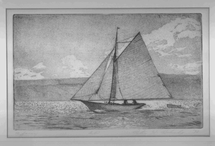
Chuck to Peter- “I found your sketches charming and artistic- indeed I wish I could recapture some of their naivete’ [Sic!] in my own work, which tends too far towards precision and realism. The final one in particular- the one of the cutter- was lovely in the extreme. I wonder what was your medium… a combination of pencil with watercolor washes? Its only failing, and it is extremely minor, is the slightly too high freeboard and incorrect placement of the mainsail battens. But the design of the clouds, values of the shoreline in the background, and drafting of the sail seams, and its general playfulness, could not be improved upon by anyone!”
Peter’s etching
Peter to Chuck: The picture of the cutter is an etching (on a 6” x 9” zinc plate). The technique of producing the fine lines of hull, rig, dinghy, waves, and mountains is to coat the plate with a ground (like varnish) and scratch through with a needle tool. Then the plate is bathed in acid to cut grooves where the ground is scratched and the ground is dissolved. The lines can be deepened by painting over those that are to remain light and bathing in acid again. The shaded areas are aquatint (the name suggests that it conveys an impression of watercolor). The plate is dusted with powdered resin and heated, leaving fine dots adhering. When bathed in acid, the dots protect the surface, and the areas around them are eaten away. Again, areas to remain light can be painted with the ground and the plate can be bathed again to deepen the grooves elsewhere. When the process is complete, the ground is dissolved, and ink is rolled onto the surface, rubbed into the etched grooves, and lightly wiped off the top. The inked plate is placed on a press bed, covered with a damp paper and blankets, and passed between rollers, pressing the paper into the grooves to pick up the ink. The product: a humble contribution to the noble tradition of E.W. Cooke, W.L. Wyllie, Arthur Briscoe, Rowland Langmaid, and others.
I must confess that the etching was inspired by a photograph of a real boat, so I disclaim errors and also some of the credit. I haven’t compared the etching with the original, but you should note that the approaching boat is foreshortened by perspective. I measured a photo of Gossoon and Minerva, two famous yachts of the 1890s here http://commons.wikimedia.org/wiki/File:Yachts_Gossoon_%26_Minerva.jpg, and from a similar angle, the ratio of freeboard to length is about the same, even though these are larger yachts. Regarding the batten placement, you can see that the top one was located to iron out wrinkles from the gaff outhaul, and none were placed below the second reef band.
Chuck to Peter-
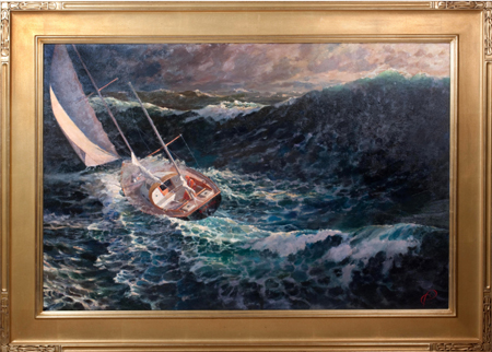
Now I understand the issue about the batten placement. If it is a portrait, it has to look like the subject. But if it is more art than portrait, remember to look in your billfold where every artist will find his Artistic License. As I always said in my writing days, “Never let the truth get in the way of a good story.” The same is true, I believe, in creating artworks. As but one example, maybe, honestly, that big wave wasn’t really that big in STORM BREAK, shown below, but the line of its top had to be very near the top of the canvas to make the compostion work, so truth be damned if it makes the finished work more fun to look at.
Peter to Chuck- Looking at your painting, I understand what you mean by precision, but I would qualify the attribute of realism, since what the eye normally sees of reality is a blur of colors and outlines, fading away in atmospheric perspective. Your distinct outlines and strong color contrasts of sea and clouds (reminiscent of Hokusai’s Great Wave) lend an intense drama to the image but risk distracting the viewer from focal points of interest and leading the eye to every detail at once. You have a unique style, though, and that defines an artist.
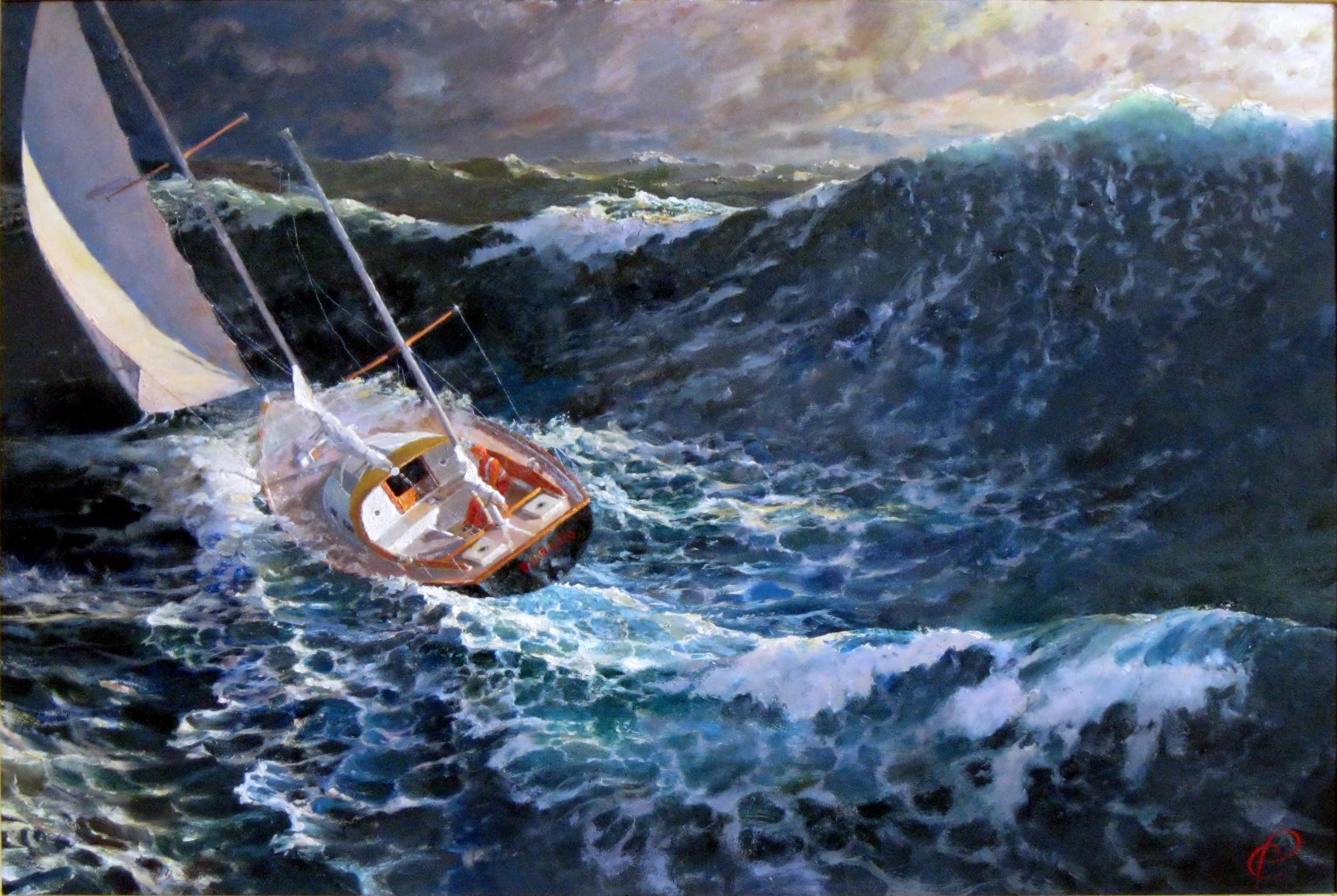
STORM BREAK by Chuck Paine
(STORM BREAK is one of my typical marines… Is he right? – Chuck)
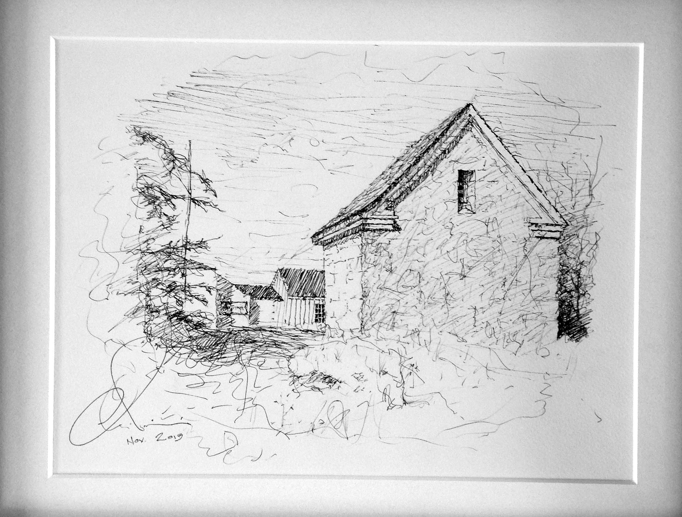
Then later Peter had this comment about one of my pen-and-inks:
Chuck-
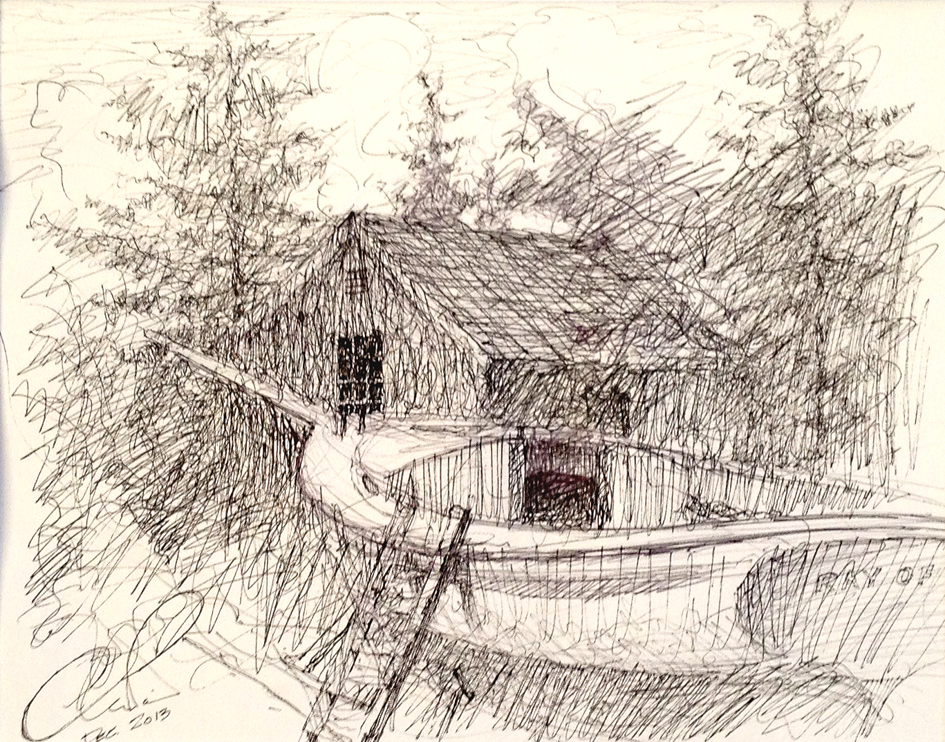
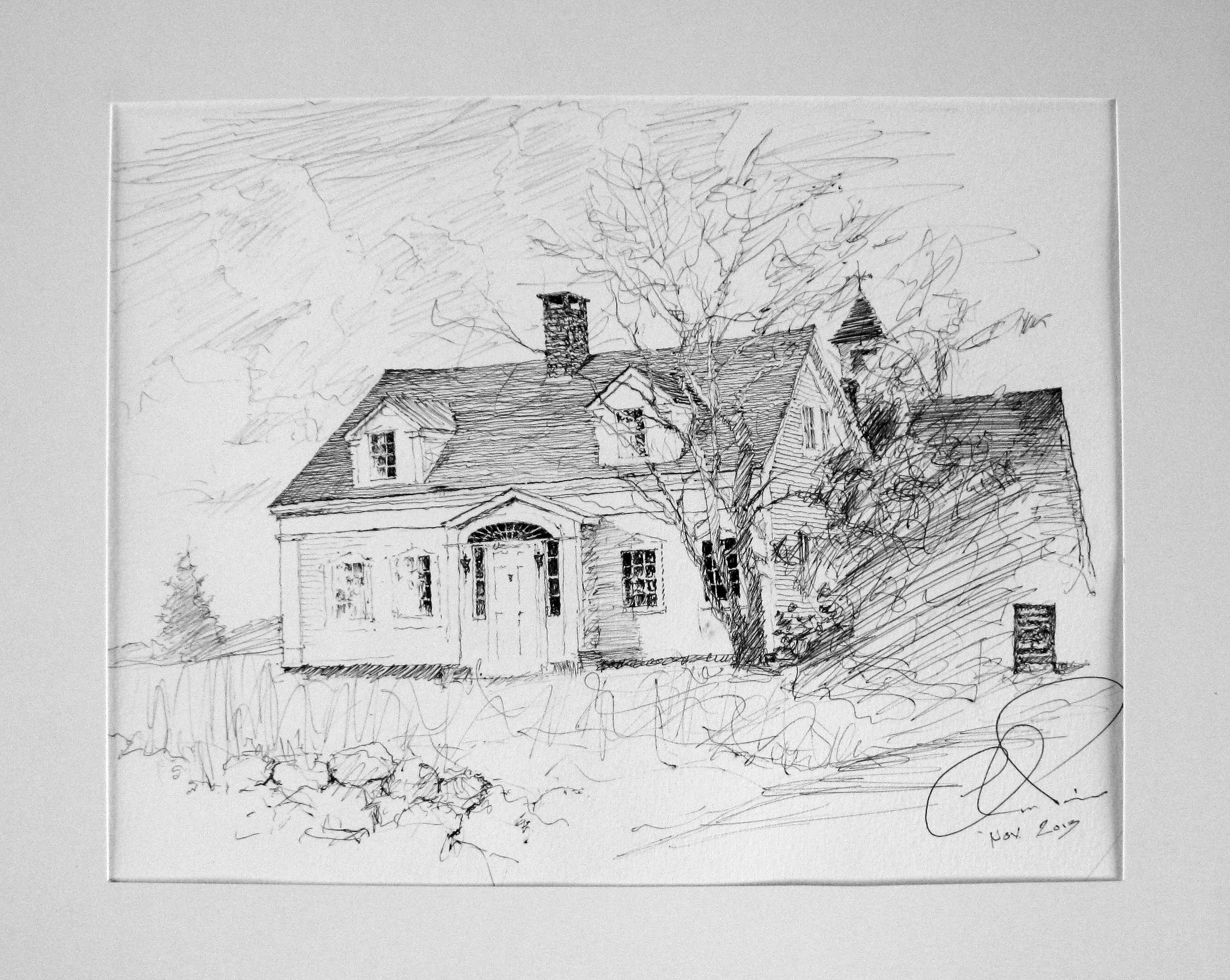
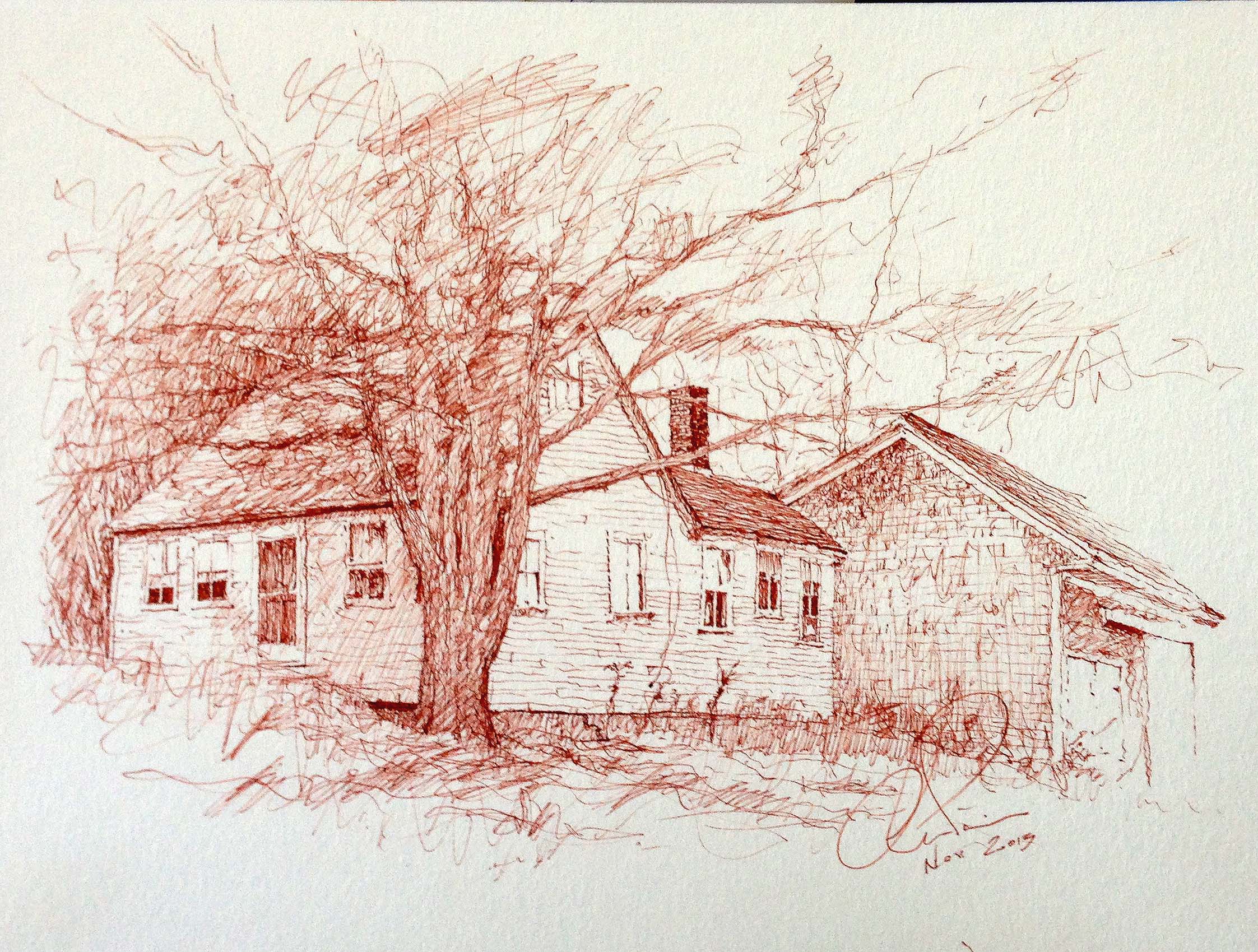
Thank you for posting our dialogue, though perhaps it would have been more informative with another round, in particular, the etching technique. Your talent for pen-and-ink drawing could be translated very fruitfully into etching. The Ray of Hope Friendship sloop drawing is something special, with the wild, yet graceful, shading lines lending an atmosphere of excitement to an otherwise static scene. It’s as if the boat felt the tug of the spring wind in the trees and the racing clouds and dreamed of launching day.
-Peter
Here is the drawing:
Ray of Hope
What do you think- is he right?


